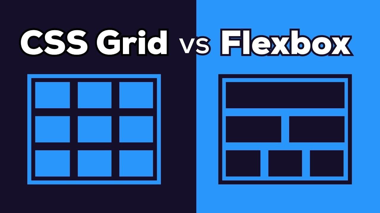
Use CSS Grid when you need to create a two-dimensional layout, meaning you are managing both rows and columns. Grid is ideal for building overall page structures like layouts that involve a header, sidebar, main content, and footer. On the other hand, Flexbox is best for one-dimensional layouts where you only need to manage the items in a row or column, like centering elements, aligning buttons, or organizing items within a component.
Mastering CSS Grid and Flexbox for Complex Layouts
Published on: 1 January 1970
Last updated on: 30 April 2026
Learn the essential skills and steps to become a full stack developer. Start your journey today with this comprehensive guide for beginners!
Understanding the Basics
What is CSS Grid?
CSS Grid is a two-dimensional layout system that allows you to control both rows and columns in a grid container. You can create responsive layouts with flexible grid items that adjust according to screen size.
.grid-container {
  display: grid;
  grid-template-columns: repeat(3, 1fr);
  grid-template-rows: auto;
  gap: 20px;
}

.grid-item {
  background-color: #f0f0f0;
  padding: 20px;
  text-align: center;
}
What is Flexbox?
Flexbox is a one-dimensional layout system that helps control the alignment, distribution, and spacing of items inside a container. It's perfect for handling rows or columns individually.
.flex-container {
  display: flex;
  justify-content: space-between;
  align-items: center;
}

.flex-item {
  background-color: #ccc;
  padding: 10px;
}
Setting Up a Simple Layout
Let’s start by setting up a simple layout that uses both Grid and Flexbox for a responsive page structure.
Explanation:
- The
grid-template-areasdefine different regions of the layout. grid-template-columns: 1fr 3fr 1frsets up the layout with a flexible sidebar, main content, and navigation.- Flexbox is used within the
header,footer,nav, andsidebarto align and space out the content properly.
HTML Structure:

<div class="grid-container">
  <header class="grid-item header">Header</header>
  <nav class="grid-item nav">Navigation</nav>
  <main class="grid-item main">Main Content</main>
  <aside class="grid-item sidebar">Sidebar</aside>
  <footer class="grid-item footer">Footer</footer>
</div>

CSS (Grid for Layout, Flexbox for Content Alignment):

/* Grid Layout */
.grid-container {
  display: grid;
  grid-template-areas:
    "header header header"
    "nav main sidebar"
    "footer footer footer";
  grid-template-columns: 1fr 3fr 1fr;
  grid-template-rows: auto 1fr auto;
  gap: 20px;
  height: 100vh;
}

.header { grid-area: header; }
.nav { grid-area: nav; }
.main { grid-area: main; }
.sidebar { grid-area: sidebar; }
.footer { grid-area: footer; }

/* Flexbox for Alignment Inside Grid Items */
.header, .footer {
  display: flex;
  justify-content: center;
  align-items: center;
}

.nav, .sidebar {
  display: flex;
  flex-direction: column;
  justify-content: space-around;
}
Frequently Asked Questions
We are the Mediusware Editorial Team, passionate about crafting insightful content on technology, software development, and industry trends. Our mission is to inform, inspire, and engage our audience with well-researched articles and thought leadership pieces. With a deep understanding of the tech landscape, we aim to be a trusted source of knowledge for professionals and enthusiasts alike.
Featureblogs
Relatedblogs
01
Top 10 Programming Languages to Use in 202402
Looking Ahead: Top 10 Software Development Trends for 202403
Top 20 Best Software Companies in Bangladesh (2024)04
7 Ways to Ensure Data Security When Outsourcing Software Development05
How to Create a Stunning WordPress Website in 2024: Step-by-Step Tutorial